Data Viz Examples
I believe that high-quality data visualization is critically important for effectively communicating research and information. Below are some samples of my own data visualization work.
Interactive Dashboard
I created the below dashboard to go with my paper “The Route to Graduation” that explored the association between transit accessibility and Pell completion rates. The dashboard allows you explore different slices of the data used in the paper, e.g. different regions and/or college types. The dashboard was developed using Shiny and R.
Note: This is just a preview window. If it isn’t displaying neatly, you are using a smaller screen, or you want to explore the dashboard in more detail, it might be easier to view it in its own window here.
Spatial Point Pattern Maps
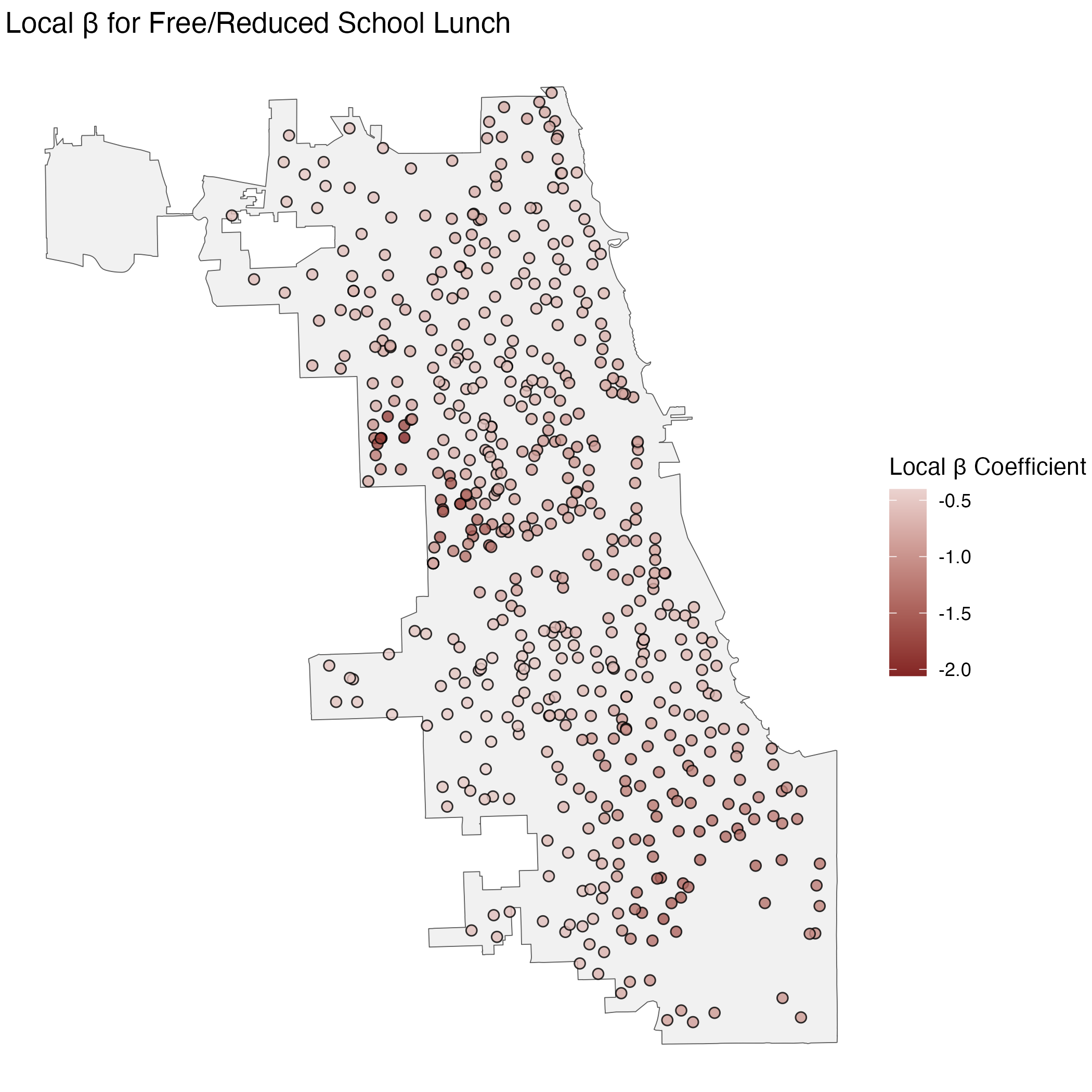
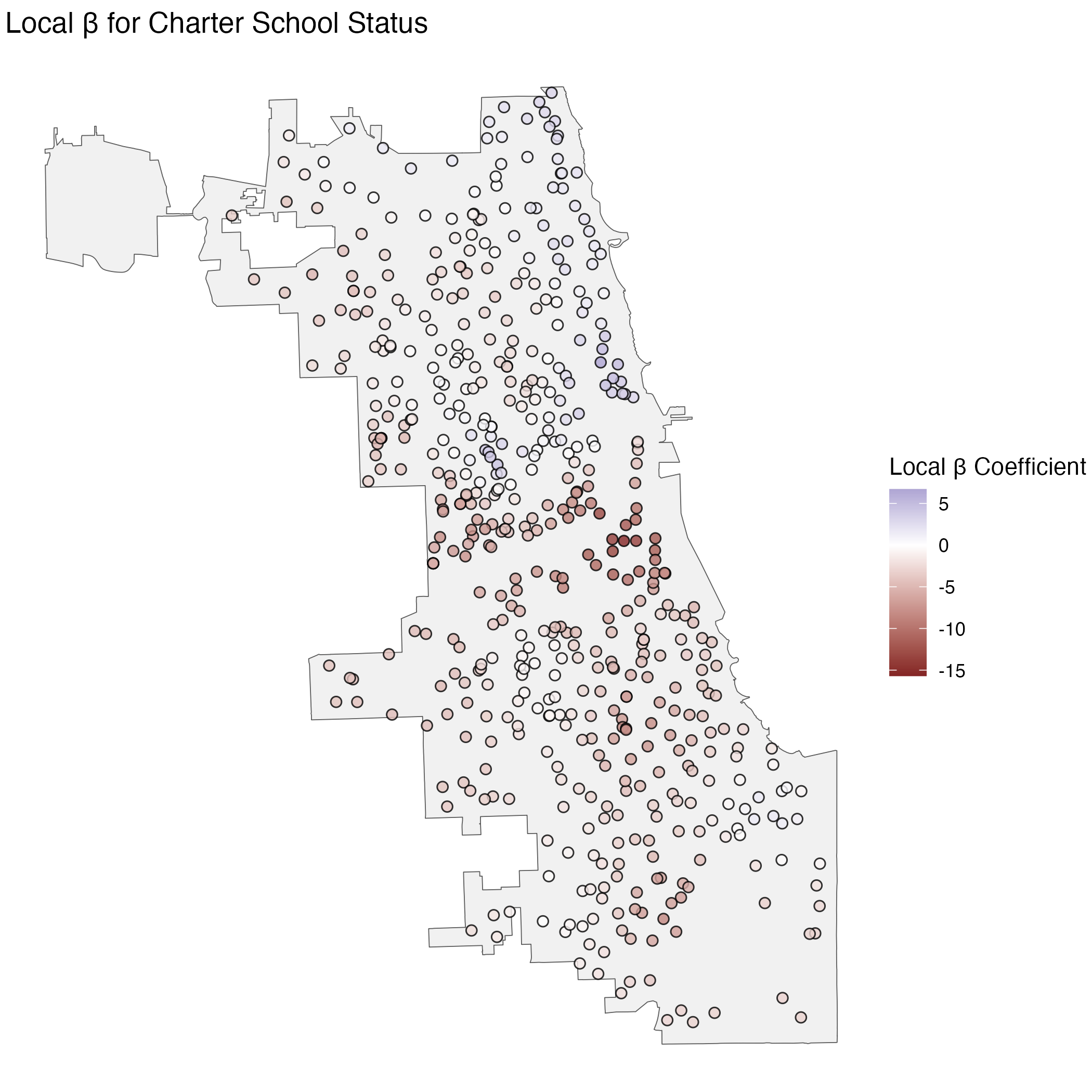
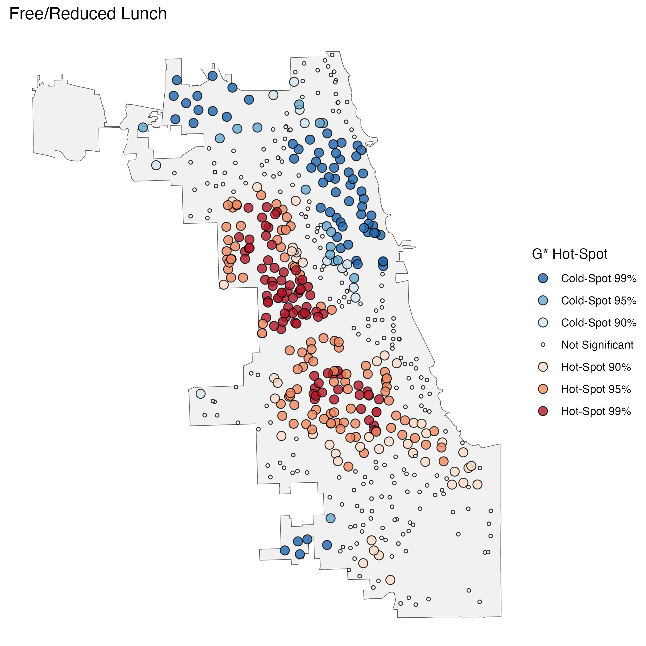
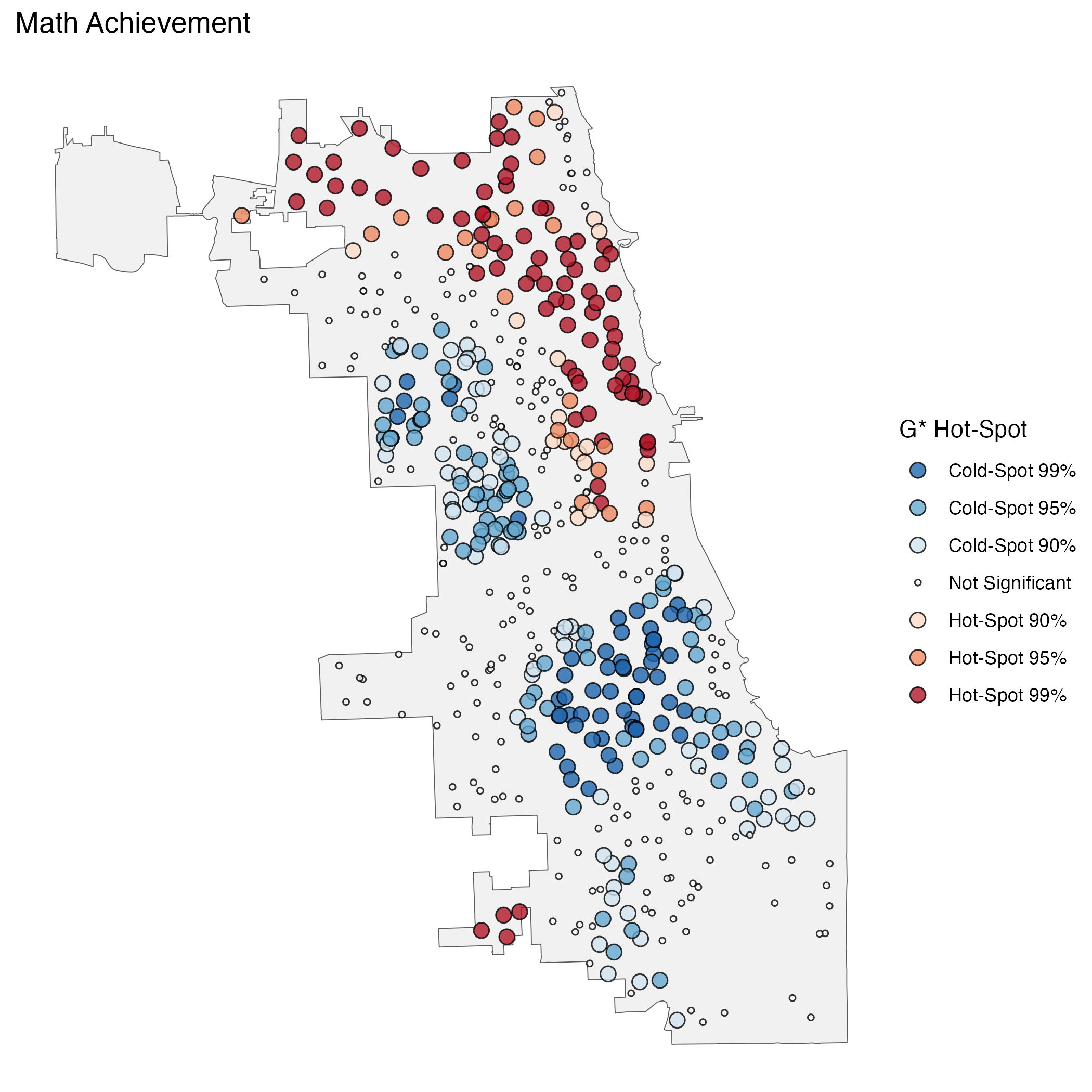
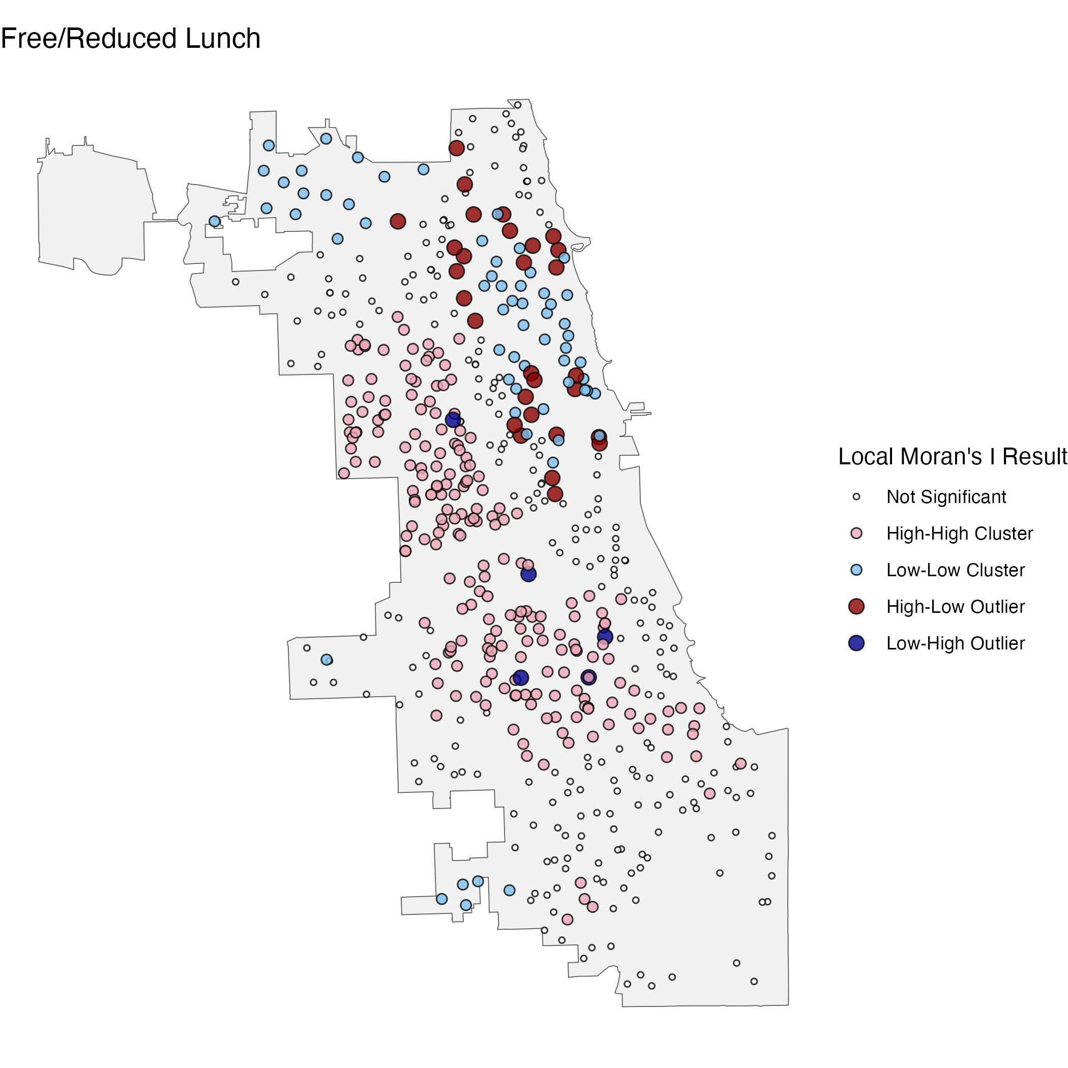
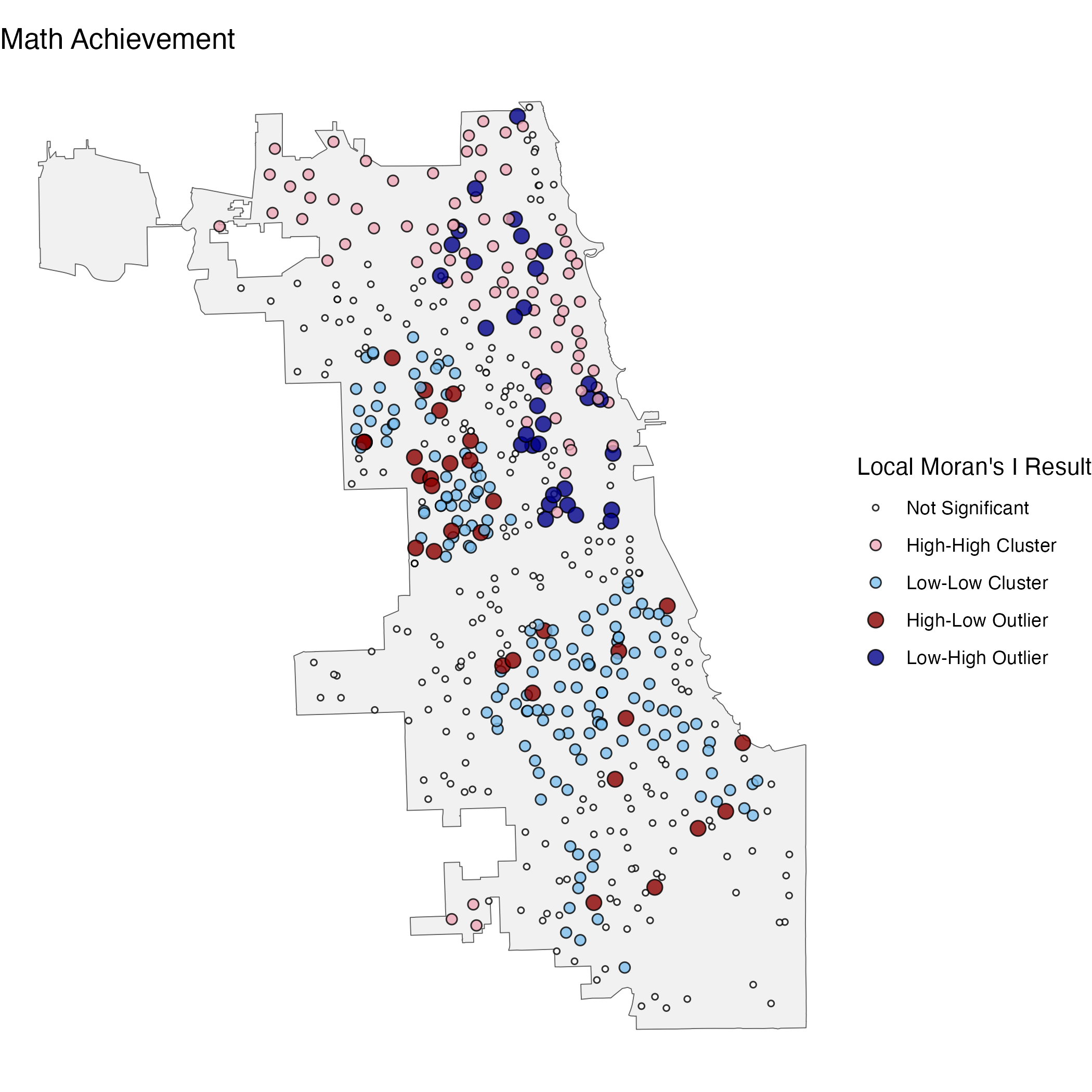
In the below tabs are some examples of maps I created with spatial data from the Chicago Public School District for math achievement and free school lunch status for the 2014/15 school year. Each set of maps display results of a different spatial statistical analysis designed to highlight the spatial distribution of the data. All these analyses use distances from, and similarity to, neighboring points to show spatial patterns in the data.
Note: these maps are intended to be an example of the statistics & visualization techniques, not to make any claims about the district.
Hot-spot analysis, specifically the Getis-Ord Global G* Statistic, shows hot- and cold-spots in the spatial distribution of a variable. Put simply, it highlights areas where nearby points are notably high or low in terms of a variable compared to the wider data. This can be useful in demonstrating spatial inequalities or gaps in outcomes across a given area.
Outlier analysis, specifically the Local Moran’s I Statistic, builds off a similar logic as hot-spot analysis but then highlights points that go against the local pattern. Put simply, it highlights points whose value of a variable is high in an area of low values, or low in an area of high values. This can be useful in demonstrating observations that are notably different (for better or worse) than their local pattern, e.g., to identify places in need of extra help or places who may have found a strategy to overcome local challenges.
Localized regression, specifically Geographically Weighted Regression, shows how estimated regression coefficients vary across space. Put simply, instead of suggesting a variable has a certain association with an outcome for all places, this calculates the model locally to show where the association might be higher or lower. GWR can help deal with spatial autocorrelation of residuals which is common when using standard regression methods with spatial data. This can be useful in demonstrating how the effect of a certain intervention or characteristic varies across a given area.
