III: Maps & Spatial Data (Feat. APIs)

RCode

  • This is a lesson I originally wrote as a TA for this class with Dr. Skinner in Spring 2023

    • It is modeled on a real map-making project I was tasked with in my Graduate Assistantship the previous summer, so is an example of the kind of task you may be asked to do

      • As well as making maps, along the way we are also going to touch on

        • Using APIs to automatically download data

        • Some very fundamental aspects of spatial data

  • I will admit, to just makes simple maps (e.g., coloring in states based on a policy adoption), there are simpler ways to go about this

    • Instead, the way we are going to cover to involves learning some basics of spatial data and how maps are made

      • This is critical to be able to do any kind of spatial data analysis in the future, such as distance calculations, and helps you make more accurate & intricate maps
  • To complete the lesson, we are going to use 3 packages

    • tidyverse and ggplot to manipulate data and make the map plots

    • tidycensus to download US Census data tied to spatial data

    • tigris to download US spatial data and make some spatial transformations

    • sf to wrangle our spatial data and integrate with ggplot

  • We already have tidyverse, but be sure to install the others if you don’t have them already

library(tidyverse)
Warning: package 'lubridate' was built under R version 4.4.1
library(sf)
Warning: package 'sf' was built under R version 4.4.1
library(tidycensus)
Warning: package 'tidycensus' was built under R version 4.4.1
library(tigris)

Reading in Data

  • Spatial data comes in many formats:
    • Shapefiles .shp: A traditional format from ESRI (the makers of ArcGIS)
      • Very widely used, by far the most common format
      • Comes as a folder containing multiple files with the same name but different extensions
        • The primary file (the one you actually read in) ends in .shp , reading one into R looks something like this
          • df_my_map <- read_sf("data/my-map-data/my-map-data")
      • Serious limitations for working with attached data, the most annoying of which is the variables can only be 7 characters long
    • Other modern, better, but (sadly) rarer formats include
      • GeoDatabase .gdb: A modern format from ESRI
      • GeoJSON .geojson: A plain text format
      • GeoPackage .gpkg: An open-source driven single file format
      • SQL Databses: Many SQL variants can store/handle spatial data
        • The sf package we are going to use is based on PostGIS which is the spatial accompaniment to PostgreSQL open source SQL
    • If you get into spatial data, you’ll want to get familiar with at least Shapefiles at first, then play around with some of the other formats
    • What’s great about sf is that it can read pretty much any format, and does so in the same way
      • read_sf("file/path.extension")

Quick Exercise

There’s so much spatial data out there, using Google see if you can find a Shapefile for something you’re interested in, download it, and read it in to R using read_sf()

Hint: US Governments of all levels provide free to use spatial data. If you’re stuck, check out Alachua County GIS Portal

For today’s lesson, however, we are going to use an API to directly download our spatial data

APIs & Setting up tidycensus

  • So what exactly is an API?
    • In short, think of it as a way of R going to a website/database and pulling data directly from the server-side or back end, without our having to ever interact with the website directly
    • This has two main advantages
      • We don’t have to store the large dataset on our computer
      • Our work becomes instantly more reproducible
        • Note from BS: We avoid point-click at all costs! We are going to use the API tidycensus today, but all APIs operate on the same basic idea
  • tidycensus is, in my opinion, one of the easiest APIs to get set up and use in R
  • Most APIs require that you use some kind of key that identifies you as an authorized user
    • Typically you need to set up the key the first time you use the API, but helpfully, it’s usually possible to store the key on your computer for all future use
    • Many API keys are free to obtain and use
      • If you were using an API to access a private database such as Google Maps, you might need to pay for your key to have access depending on how much you use it
      • But because we are using Census data, which is freely available to the public, there’s no charge

Getting Census API Key

  • Getting your Census API key is extremely easy
    1. Simply go here
    2. Enter your organization name (University of Florida)
    3. Enter your UF email
      • You will quickly receive an email with your API key, which you will need below
  • To set up tidycensus for the first time, we first need to set our API key
  • The tidycensus package makes this much easier than many APIs by having a built-in function that you can use to save your API key to your computer
    • Simply place your API key in the <key> of the code below
    • The install option means it will save the API key for future use, so you will not need to worry about this step again
## ---------------------------
##' [set API key]
## ---------------------------

## you only need to do this once: replace everything between the
## quotes with the key in the email you received
##
## eg. census_api_key("XXXXXXXXXXXXXXXXXX", install = T)
census_api_key("<key>", install = T)
  • Now that this is set up, we are ready to start using tidycensus — yay!

Reading in data with tidycensus

  • There are multiple main tidycensus functions that you can use to call in data, with each calling data from a different source operated by the US Census Bureau
    • get_acs()
    • get_decennial()
    • get_estimates()
    • get_flows()
    • get_pop_groups()
    • get_pums()
  • You can see more information about these on the tidycensus reference page
  • For today’s lesson we are going to use get_acs()
  • We are going to assign <- the data we pull down into the object df_census:
## ---------------------------
##' [Get ACS Data]
## ---------------------------

df_census <- get_acs(geography = "county",
                     state = "FL",
                     year = 2021,
                     variables = "DP02_0065PE", # Pop >=25 with Bachelors
                     output = "wide",
                     geometry = TRUE)
Warning: • You have not set a Census API key. Users without a key are limited to 500
queries per day and may experience performance limitations.
ℹ For best results, get a Census API key at
http://api.census.gov/data/key_signup.html and then supply the key to the
`census_api_key()` function to use it throughout your tidycensus session.
This warning is displayed once per session.

Let’s walk through each element of this command in turn:

  • geography = "county"
    • Telling the function to get estimates (and spatial data later) at the county level
      • this could also be "state", for example, to get state level data
  • state = "FL"
    • Telling the function to get data only for the state of Florida
      • You could put a group of states with c()
        • use full state names, or use FIPS codes — tidycensus is flexible
      • If you want a narrower set of data, you could also add county =, which works in a similar way
        • For example, if you added county = "Alachua", you would only get county-level data for Alachua County, Florida.
  • year = 2021
    • Telling the function to pull data for the survey year 2021
      • For ACS, this will be the survey set ending in that year
    • Keep in mind that some data are not available for every year
      • For example, data from the full decennial census are only available for 2010 or 2020.
  • variables = "DP02_0065PE"
    • Telling the function to pull the variable coded "DP02_0065PE"
      • Which is the percentage of the population older than 25 with a Bachelor’s degree
    • This is the only tricky part of using tidycensus: understanding Census API’s variable names
      • Let me breakdown what we are calling here:
        • DP02_0065
          • This is the main variable code the census uses
          • You can find these by using the load_variables() command, but doing so creates a massive table in R that is hard to navigate through
          • An easier way is to go the census API’s list of variables for the dataset you are using, which for the 2021 ACS is here (change the years/data sources as needed for other surveys)
            • In here you can crtl-f or cmd-f search for the variable you are looking for
            • For this variable we could search “bachelor,” which will highlight all the variables that have “bachelor” in the title
            • Find the variable you want and copy the name.
        • PE
          • You will notice there are multiple DP02_0065 variables
            • These are the same underlying variable, but in different forms.
          • The common endings are E or PE
            • Which stand for Estimate and Percentage Estimate respectively
          • For today’s lesson, we want the percentage estimate PE
            • If you want the total count instead, select E
        • so we will select DP02_0065PE,
          • This will give us
            • DP02_0065PEthe percent estimate of Bachelor’s degree attainment for those 25 years old and above
            • DP02_0065PM which is the margin of error for the percentage (hence the M at the end)
              • We don’t need this for our mapping, but it downloads automatically and is useful for some statistical calcualtions
  • output = "wide"
    • Telling it we want the data in a wide format
    • Think back to Data Wrangling II: wide data means having a separate column for each variable whereas long data would be in two columns, one with the variable name and one with the variable value
    • For ease of plotting/mapping the variables, we are going to want it in wide format
  • geometry = TRUE
    • Telling the function we want to download geometry (a kind of spatial data) to go with our census data
    • By default, this is FALSE , which just downloads the Census data
    • This saves us having to deal with finding, loading, and joining a shapefile to make our map

Quick Excercise

Using the API variable dictionary we used above, add another variable to your get_acs() using c()

Okay, let see what the top of our new data looks like.

## show header of census data
head(df_census)
Simple feature collection with 6 features and 4 fields
Geometry type: MULTIPOLYGON
Dimension:     XY
Bounding box:  xmin: -82.57599 ymin: 27.64324 xmax: -80.73292 ymax: 30.14312
Geodetic CRS:  NAD83
  GEOID                    NAME DP02_0065PE DP02_0065PM
1 12095  Orange County, Florida        23.0         0.6
2 12125   Union County, Florida         7.6         2.1
3 12069    Lake County, Florida        16.0         0.9
4 12127 Volusia County, Florida        16.8         0.5
5 12105    Polk County, Florida        14.0         0.5
6 12119  Sumter County, Florida        19.4         1.4
                        geometry
1 MULTIPOLYGON (((-81.65856 2...
2 MULTIPOLYGON (((-82.57599 2...
3 MULTIPOLYGON (((-81.95616 2...
4 MULTIPOLYGON (((-81.6809 29...
5 MULTIPOLYGON (((-82.1062 28...
6 MULTIPOLYGON (((-82.31133 2...
  • It looks a bit different than a normal data frame
    • For now, let’s not worry too much about the first few lines which give a summary of the spatial aspects of the our downloaded data
    • If you look underneath those lines, from GEOID to DP02_0065PM, you’ll see something that looks more like the tibbles we are familiar with
    • Then, in the last column, we get to our spatial data in the geometry column
    • If you open df_census in the viewer, it looks like a normal data frame ending with this slightly different column called geometry
      • Note: I wouldn’t recommend often looking through spatial data in the file viewer as the the spatial data is often huge and can make it slow/laggy
        • If you need to dig into the data that way, use st_drop_geometry() to remove the spatial features, then either print or view it
## view data frame without geometry data
df_census_view <- df_census |>
  st_drop_geometry()

head(df_census_view)
  GEOID                    NAME DP02_0065PE DP02_0065PM
1 12095  Orange County, Florida        23.0         0.6
2 12125   Union County, Florida         7.6         2.1
3 12069    Lake County, Florida        16.0         0.9
4 12127 Volusia County, Florida        16.8         0.5
5 12105    Polk County, Florida        14.0         0.5
6 12119  Sumter County, Florida        19.4         1.4

A (Very) Brief Overview of Spatial Data

  • We do not have time to really get into all the complexities of spatial data in this class, so, unfortunately, it will have to remain a bit of black box for now

Vectors vs Rasters

  • When looking online for spatial data, you might see how spatial data can be either in vector or raster format
    • For our purpose today (and most of the time outside certain use cases) everything is going to be vector
      • Similar to a vector in R (a column or list of data)
        • Just a collection of data points that represent something
          • Only this time it’s representing something spatial
          • Think of it like instructions to draw a shape
    • Raster data, on the other hand, is a grid with information assigned to each square
      • Think of it like a big paint-by-numbers grid and the shape you see is where some squares are filled in
      • Commonly used for satellite imagery analysis
        • Doesn’t scale well for mapping

Spatial Data Vectors

  • No matter the format, working with spatial data involves two things
    • The data itself (the numbers in the geometry column)
    • How that data is projected (the CRS, which we will cover below)
  • The data in a spatial vector come in three primary formats
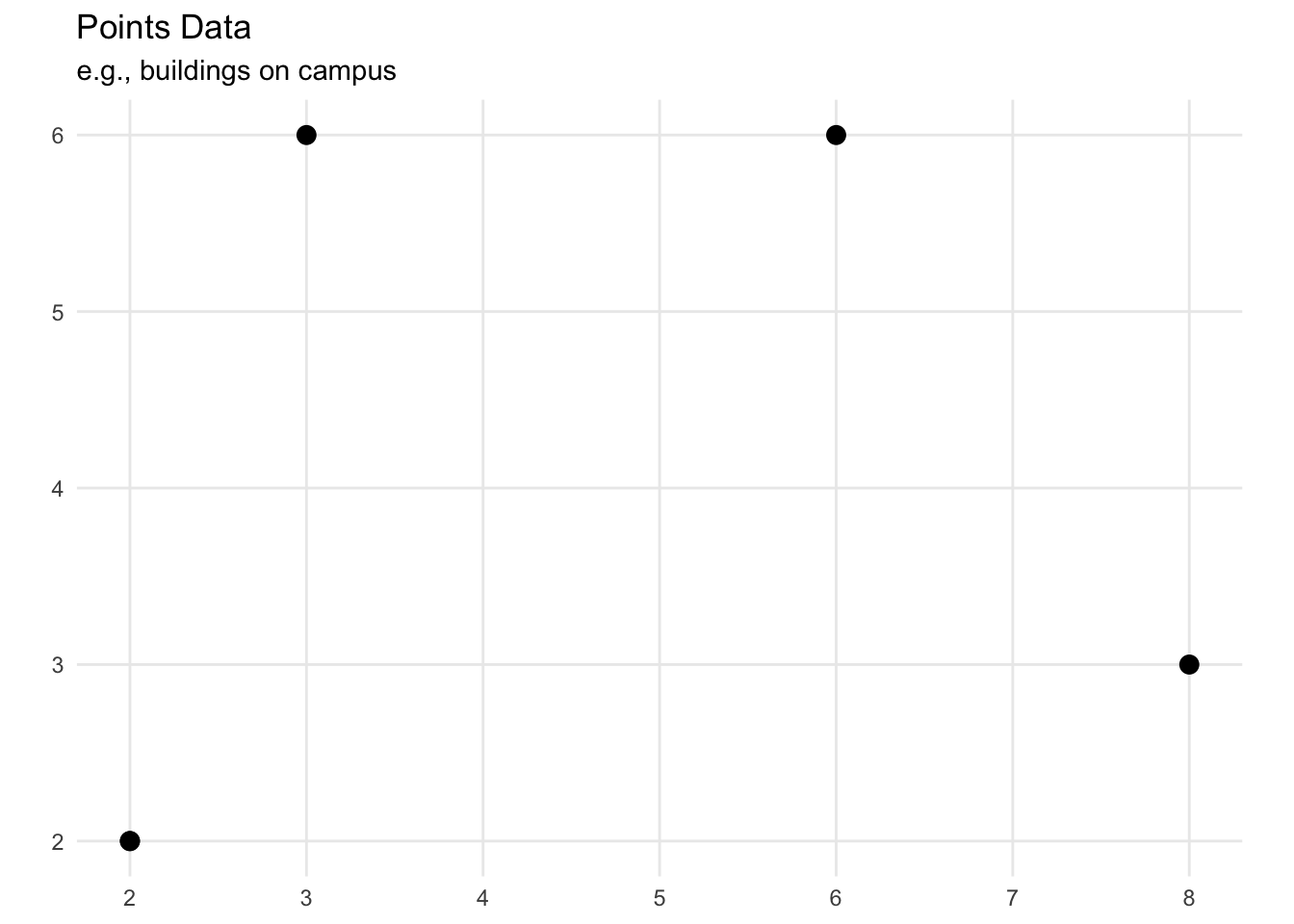
    • points (think dots on a map)
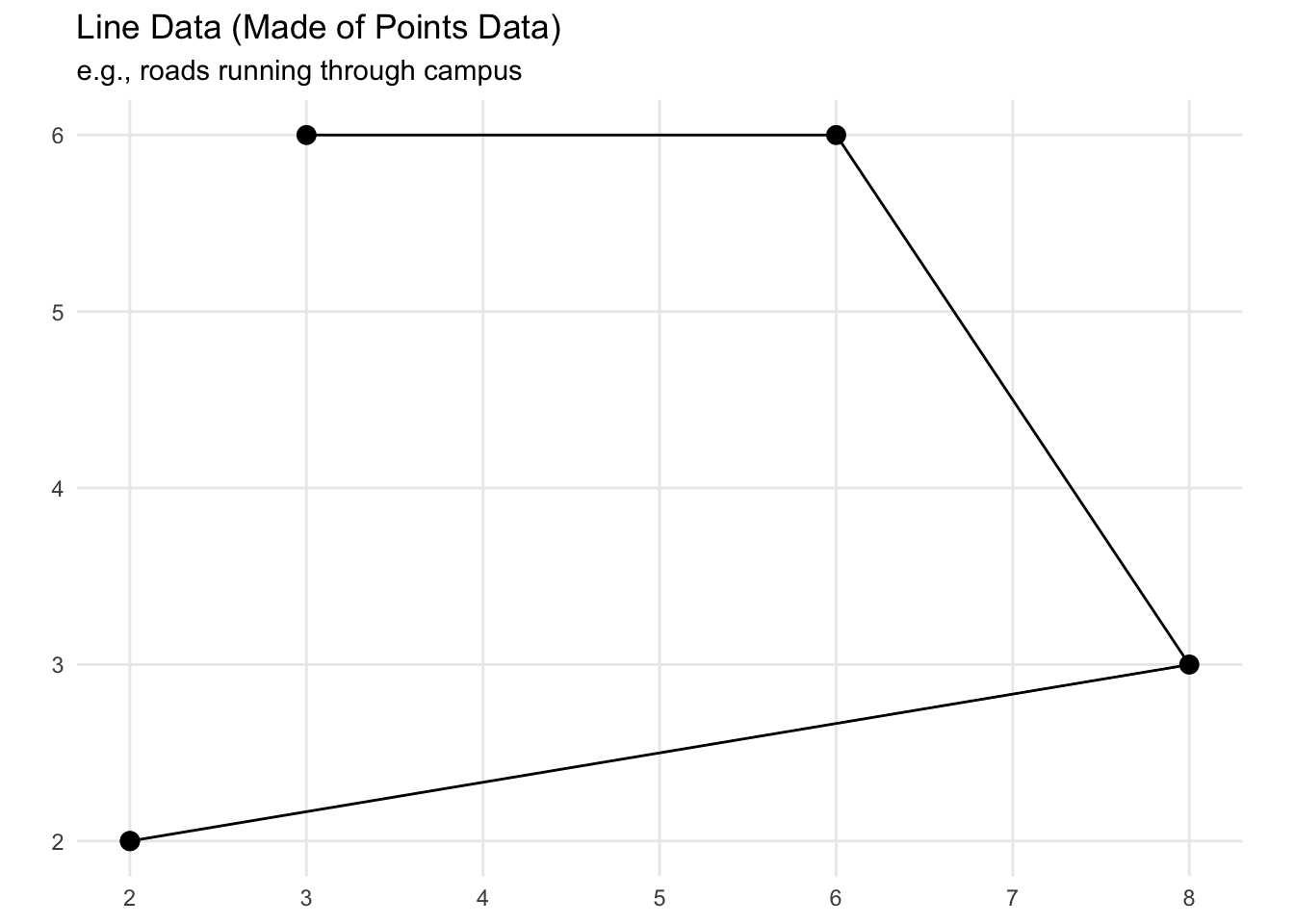
    • lines (think a line connecting two points on a map)
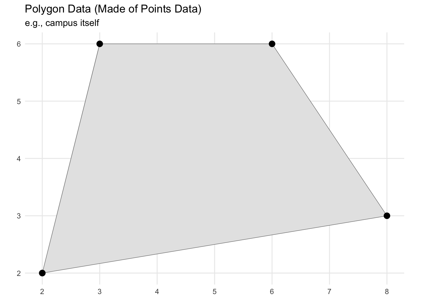
    • polygons (think a collection of lines on a map that create a closed shape)
      • You can also have multi-polygons or multi-lines, which are just multiple shapes that represent that observation
    • Ultimately though, it all comes back to point data, everything else is made up of those

  • In this lesson we are going to use both point and polygon data (you won’t see line data as often in the wild)
  • If this sounds complicated, fear not! It is much simpler than it sounds right now!

Coordinate Reference Systems (CRS)

  • For purposes of this lesson, the only internal workings of spatial data we need to be aware of is something called the Coordinate Reference System or CRS
    • Our earth is not flat, but rather is a curved three-dimensional object (Note from Ben: this is most likely true)
    • Since we don’t want to carry around globes, we take this 3D object and squish it into two dimensions on a map
    • This process necessarily involves some kind of transformation, compromise, or projection
  • In a nutshell, this is a very simplified explanation of what a CRS decides
    • it’s how we are deciding to twist, pull, squish a 3D Earth surface into a flat surface
    • Turns out this matters a lot depending on what purpose your map is for
    • There are, as you can see by this list, also a lot of localized CRS projections
      • The more local a projection, the less it has to twist, pull, stretch, or squish data
        • This means it can be more accurate, with less compromise, for that specific area
          • But if you use a localized projection for the wrong area, you’re going to be way off
          • If you’re doing spatial analysis (distance calculations etc.) it’s best to the use most local projection you can that is still valid for your whole study area
  • Here’s a (somewhat old) pop culture look at this issue from one of my favorite shows…
  • This is a relatively complicated process we are not going to go into here. If you’re interested here’s a nice introduction to CRS by QGIS
  • For our class we are going to use the CRS EPSG 4326
    • In essence a projection that
      • Makes east/west run straight left/right
      • Makes north/south run straight up/down
      • Keeps all latitude and longitude degrees equally spaced apart (much to the dismay of our friends from the OCSE)
    • All different CRS have their advantages and disadvantages
      • This is nice and simple for quick descriptive maps, but distorts shapes in ways that might be harmful, particularly if you are going to do any distance calculations, etc.

Note from Ben: If you are going to do spatial work in education research (other than just making maps for display), you really need to know what your projection is doing. Even if you are just making maps for display, some projections are, IMNSHO, more aesthetically pleasing that others in different situations.

  • Keep an eye out for crs = 4326 as we go through some examples plotting spatial data below.

How R Stores All This Spatial Data

  • As we saw above, there is a column on the end of our data called geometry
    • This is not technically a column like we are used to
      • E.g., you can’t join(df_one, df_two, by = geometry) or filter(geometry == x) like we do with other variables in our data frames
        • If you want to spatially join or filter data, you have to use
          • st_filter()
          • st_join()
        • Using these is bit beyond where we will get in this class, but, note this for future work, it can be really useful
    • Instead, think of it as a special attachment R places on each observation

Summary of Spatial Data Basics

In short, what you need to know about spatial data for this lesson is this:

  • R stores spatial data in something called geometry attached to each observation/row
    • To handle these spatial aspects of the data, you can’t just filter() it like normal; instead you have to use functions from a spatial data package such as sf or tigris
  • The CRS (coordinate reference system) is how we choose to account for the earth being curved
    • Crucial for mapping is that everything we use on the plot is using the same CRS
    • Using crs = 4326 will give a nice simple flat projection
      • This projection has drawbacks, but is easy to work with and so is what we will use for now

Let’s Make a Map (finally)!

If we have made it this far, things are about to get much more interesting and hands-on!

  • We are going to make an education-focused map based on template I used for a real consulting project Summer 2022 as part of my GA-ship
  • This template is really adaptable for a lot the kind of maps we might want educational research and reports
  • So let’s get started!
    • We are going to have two layers
      • A base map with the census data we already downloaded
      • A layer of points on top representing colleges

Layer One: Base Map

  • Before we plot anything, particularly since we are going to have multiple layers, we want to check our CRS
## ---------------------------------------------------------
##' [Making a map (finally)]
## ---------------------------------------------------------
## ---------------------------
##' [Layer one: base map]
## ---------------------------

## show CRS for dataframe
st_crs(df_census)
Coordinate Reference System:
  User input: NAD83 
  wkt:
GEOGCRS["NAD83",
    DATUM["North American Datum 1983",
        ELLIPSOID["GRS 1980",6378137,298.257222101,
            LENGTHUNIT["metre",1]]],
    PRIMEM["Greenwich",0,
        ANGLEUNIT["degree",0.0174532925199433]],
    CS[ellipsoidal,2],
        AXIS["latitude",north,
            ORDER[1],
            ANGLEUNIT["degree",0.0174532925199433]],
        AXIS["longitude",east,
            ORDER[2],
            ANGLEUNIT["degree",0.0174532925199433]],
    ID["EPSG",4269]]

That isn’t our simple flat EPSG 4326, so we are going to st_transform() to set that.

## transform the CRS to 4326
df_census <- df_census |>
  st_transform(crs = 4326)

Then we can check again…

## show CRS again; notice how it changed from NAD93 to EPSG:4326
st_crs(df_census) 
Coordinate Reference System:
  User input: EPSG:4326 
  wkt:
GEOGCRS["WGS 84",
    ENSEMBLE["World Geodetic System 1984 ensemble",
        MEMBER["World Geodetic System 1984 (Transit)"],
        MEMBER["World Geodetic System 1984 (G730)"],
        MEMBER["World Geodetic System 1984 (G873)"],
        MEMBER["World Geodetic System 1984 (G1150)"],
        MEMBER["World Geodetic System 1984 (G1674)"],
        MEMBER["World Geodetic System 1984 (G1762)"],
        MEMBER["World Geodetic System 1984 (G2139)"],
        ELLIPSOID["WGS 84",6378137,298.257223563,
            LENGTHUNIT["metre",1]],
        ENSEMBLEACCURACY[2.0]],
    PRIMEM["Greenwich",0,
        ANGLEUNIT["degree",0.0174532925199433]],
    CS[ellipsoidal,2],
        AXIS["geodetic latitude (Lat)",north,
            ORDER[1],
            ANGLEUNIT["degree",0.0174532925199433]],
        AXIS["geodetic longitude (Lon)",east,
            ORDER[2],
            ANGLEUNIT["degree",0.0174532925199433]],
    USAGE[
        SCOPE["Horizontal component of 3D system."],
        AREA["World."],
        BBOX[-90,-180,90,180]],
    ID["EPSG",4326]]
Looks good!

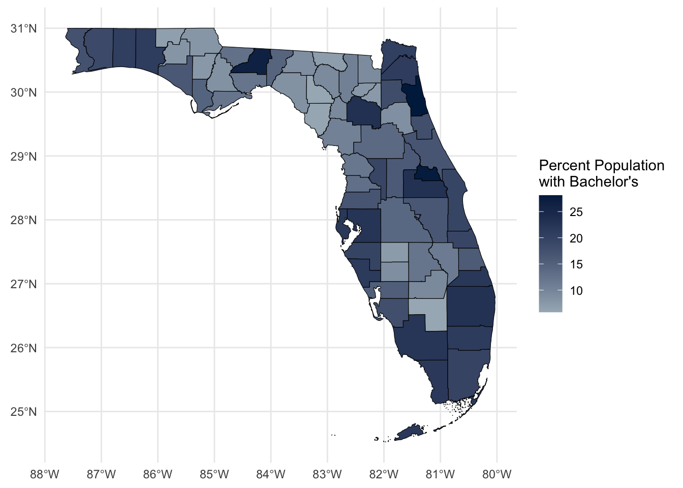
  • Okay, with our CRS now set, let’s plot our base map.
    • We actually use the familiar ggplot() to make our maps because there is a special geom_* that works with spatial data
      • geom_sf()
      • Everything works in a similar way to our normal plots, so this should be familiar. Luckily all the tricky spatial aspects are handled by ggplot for us.
  • The below code will make our base map, and store in an object called base_map
## create base map
base_map <- ggplot() +
  geom_sf(data = df_census,
          aes(fill = DP02_0065PE),
          color = "black",
          size = 0.1) +
  labs(fill = str_wrap("Percent Population with Bachelor's", 20)) +
  scale_fill_gradient(low = "#a6b5c0", high = "#00254d") +
  theme_minimal()

Let’s go through each line of the geom_sf() as we did for get_acs() above:

  • data = df_census
    • All we need to do take make our spatial plot is call a data frame with a geometry attachment. geom_sf() will handle how to plot that for us.
  • aes(fill = DP02_0065PE)
    • Much like we would with a box plot, we are simply telling ggplot to fill the shapes (in our case, Florida’s counties) based on that variable
    • So here we are filling Florida’s counties based on the percent of the population over 25 with a Bachelor’s degree (the variable we chose from tidycensus)
  • color = "black"
    • Remember since this is outside the aes() argument it will applied consistenly across the plot. We are telling it to make all the lines black.
  • size = 0.1
    • Similarly, we are telling to make the lines 0.1 thickness (thinner than the default)

Then we have added two visual alterations like we covered in the second plotting lesson. For a quick reminder:

  • labs(fill = str_wrap("Percent Population with Bachelor's", 20))
    • Is saying to give the legend for fill this title
      • The new function, str_wrap() says to make a newline (wrap) when there are more than 20 characters
  • scale_fill_gradient(low = "#a6b5c0", high = "#00254d")
    • Is telling fill with a color gradient starting at with light slate blue and finishing with a dark slate blue
  • Now, let’s call our base_map object to see what this looks like
## call base map by itself
base_map

Woohoo! We have made a map!

Data Viz II Throwback

  • Remember in the second lesson on data visualization we spent the entire time customizing the appearance of a single plot?
  • geom_sf() is just another type of ggplot, so, we can use all the same things we learned

Quick Exercise

  1. Play around with the scale_fill_gradient to use your favorite color
  2. Play around with the theme argument, can you find the theme that gets rid of all grid lines?

Now we are going to make it more interesting with one more layer…

Layer Two: Institution Points

  • A lot of education data comes with a latitude and longitude for the institution
  • Today we are going to use IPEDS, but you can certainly get these for K-12 schools and a whole lot more besides
    • Caution: I have noticed in my own work that IPEDS coordinates are not always the most consistent (an issue we have seen with other IPEDS data through the course)
      • If you’re wanting to do something that where precision really matters the Department of Homeland Security has open data that, in my experience, is more consistent with Google Maps locations
        • It also provides polygons of larger college campuses rather than just coordinate points, which might be useful for some of your research (I’m using them at the moment)
  • For today, we are going to read in some library data from IPEDS that I cleaned and merged earlier
    • This is a combination of HD and AL data files for 2021
## ---------------------------
##' [Layer Two: Institutions]
## ---------------------------

## read in IPEDS data
df_ipeds <- read_csv("data/mapping-api-data.csv")

Let’s take a look at our data

## show IPEDS data
head(df_ipeds)
# A tibble: 6 × 78
  UNITID INSTNM CONTROL ICLEVEL STABBR  FIPS COUNTYNM COUNTYCD LATITUDE LONGITUD
   <dbl> <chr>    <dbl>   <dbl> <chr>  <dbl> <chr>       <dbl>    <dbl>    <dbl>
1 100654 Alaba…       1       1 AL         1 Madison…     1089     34.8    -86.6
2 100663 Unive…       1       1 AL         1 Jeffers…     1073     33.5    -86.8
3 100690 Amrid…       2       1 AL         1 Montgom…     1101     32.4    -86.2
4 100706 Unive…       1       1 AL         1 Madison…     1089     34.7    -86.6
5 100724 Alaba…       1       1 AL         1 Montgom…     1101     32.4    -86.3
6 100751 The U…       1       1 AL         1 Tuscalo…     1125     33.2    -87.5
# ℹ 68 more variables: LEXP100K <dbl>, LCOLELYN <dbl>, XLPBOOKS <chr>,
#   LPBOOKS <dbl>, XLEBOOKS <chr>, LEBOOKS <dbl>, XLEDATAB <chr>,
#   LEDATAB <dbl>, XLPMEDIA <chr>, LPMEDIA <dbl>, XLEMEDIA <chr>,
#   LEMEDIA <dbl>, XLPSERIA <chr>, LPSERIA <dbl>, XLESERIA <chr>,
#   LESERIA <dbl>, XLPCOLLC <chr>, LPCLLCT <dbl>, XLECOLLC <chr>,
#   LECLLCT <dbl>, XLTCLLCT <chr>, LTCLLCT <dbl>, XLPCRCLT <chr>,
#   LPCRCLT <dbl>, XLECRCLT <chr>, LECRCLT <dbl>, XLTCRCLT <chr>, …
  • We see a normal data frame for colleges with bunch of variables
  • Most importantly for right now, we see latitude and longitude
    • Latitude and longitude represent something spatial, but they’re not quite spatial data like R knows
    • Let’s change that!
## convert coordinates columns into a true geometry column; this is
## much more reliable than simply plotting them as geom_points as it
## ensures the CRS matches etc.
df_ipeds <- df_ipeds |> 
  st_as_sf(coords = c("LONGITUD", "LATITUDE"))
  • Above we call st_as_sf()
    • then tell it the coordinates, coords =, are in columns name LONGITUD and LATITUDE
    • The order these go is very important (and changes between some systems) but for sf it’s longitude then latitude as we follow the usual x, y order
      • Longitude tells you were you are east/west on the globe, it translates to the x axis
      • Latitude gives you north/south direction, it translates to the y axis
  • If we look at our data again, we are going to see that spatial summary again as R has attached some point geometry to our college data based on the coordinates
## show IPEDS data again
head(df_ipeds)
Simple feature collection with 6 features and 76 fields
Geometry type: POINT
Dimension:     XY
Bounding box:  xmin: -87.54598 ymin: 32.36261 xmax: -86.17401 ymax: 34.78337
CRS:           NA
# A tibble: 6 × 77
  UNITID INSTNM CONTROL ICLEVEL STABBR  FIPS COUNTYNM COUNTYCD LEXP100K LCOLELYN
   <dbl> <chr>    <dbl>   <dbl> <chr>  <dbl> <chr>       <dbl>    <dbl>    <dbl>
1 100654 Alaba…       1       1 AL         1 Madison…     1089        1        2
2 100663 Unive…       1       1 AL         1 Jeffers…     1073        1        2
3 100690 Amrid…       2       1 AL         1 Montgom…     1101        1        2
4 100706 Unive…       1       1 AL         1 Madison…     1089        1        2
5 100724 Alaba…       1       1 AL         1 Montgom…     1101        1        2
6 100751 The U…       1       1 AL         1 Tuscalo…     1125        1        2
# ℹ 67 more variables: XLPBOOKS <chr>, LPBOOKS <dbl>, XLEBOOKS <chr>,
#   LEBOOKS <dbl>, XLEDATAB <chr>, LEDATAB <dbl>, XLPMEDIA <chr>,
#   LPMEDIA <dbl>, XLEMEDIA <chr>, LEMEDIA <dbl>, XLPSERIA <chr>,
#   LPSERIA <dbl>, XLESERIA <chr>, LESERIA <dbl>, XLPCOLLC <chr>,
#   LPCLLCT <dbl>, XLECOLLC <chr>, LECLLCT <dbl>, XLTCLLCT <chr>,
#   LTCLLCT <dbl>, XLPCRCLT <chr>, LPCRCLT <dbl>, XLECRCLT <chr>,
#   LECRCLT <dbl>, XLTCRCLT <chr>, LTCRCLT <dbl>, LILLDYN <dbl>, …

Quick Question

Something’s not quite right, can you tell me what?

Hint: It’s something we just talked about being very important

  • This means R will not be able to turn that spatial data into a map
    • Basically, R knows we have spatial data, but it doesn’t know how we want to put it onto a 2D surface (how to project it)
  • To be sure, let’s check the it directly
## check CRS for IPEDS data
st_crs(df_ipeds)
Coordinate Reference System: NA

Yep, NA… Luckily the fix for this is simple

## add CRS to our IPEDS data
df_ipeds <- df_ipeds |> 
  st_set_crs(4326) # When you first add coordinates to geometry, it doesn't know
                   # what CRS to use, so we set to 4326 to match our base map data

Okay, let’s have another look…

## check CRS of IPEDS data again
st_crs(df_ipeds)
Coordinate Reference System:
  User input: EPSG:4326 
  wkt:
GEOGCRS["WGS 84",
    ENSEMBLE["World Geodetic System 1984 ensemble",
        MEMBER["World Geodetic System 1984 (Transit)"],
        MEMBER["World Geodetic System 1984 (G730)"],
        MEMBER["World Geodetic System 1984 (G873)"],
        MEMBER["World Geodetic System 1984 (G1150)"],
        MEMBER["World Geodetic System 1984 (G1674)"],
        MEMBER["World Geodetic System 1984 (G1762)"],
        MEMBER["World Geodetic System 1984 (G2139)"],
        ELLIPSOID["WGS 84",6378137,298.257223563,
            LENGTHUNIT["metre",1]],
        ENSEMBLEACCURACY[2.0]],
    PRIMEM["Greenwich",0,
        ANGLEUNIT["degree",0.0174532925199433]],
    CS[ellipsoidal,2],
        AXIS["geodetic latitude (Lat)",north,
            ORDER[1],
            ANGLEUNIT["degree",0.0174532925199433]],
        AXIS["geodetic longitude (Lon)",east,
            ORDER[2],
            ANGLEUNIT["degree",0.0174532925199433]],
    USAGE[
        SCOPE["Horizontal component of 3D system."],
        AREA["World."],
        BBOX[-90,-180,90,180]],
    ID["EPSG",4326]]
And we see we have our nice CRS back!

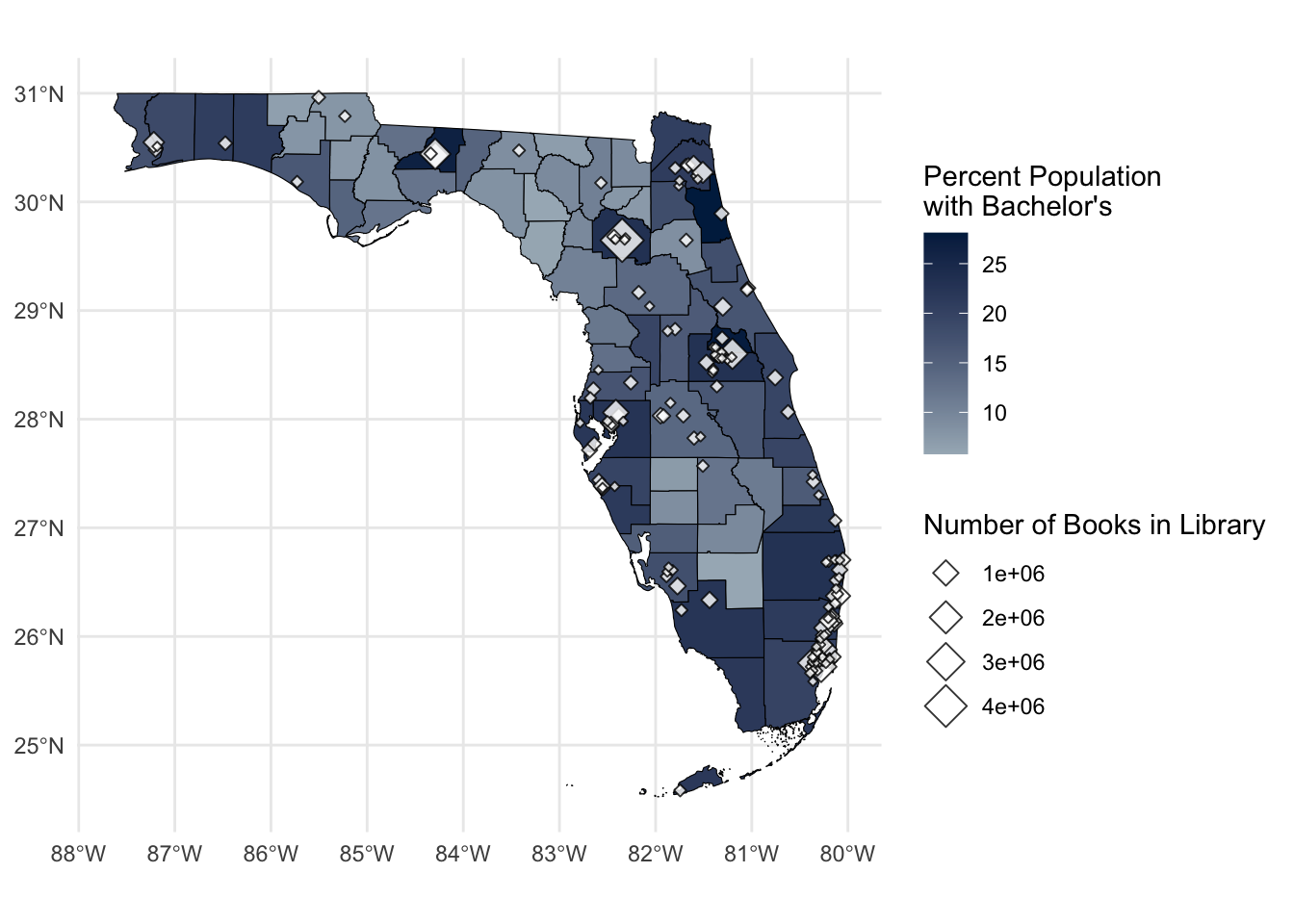
  • Okay, now the hard work is done, we just need to call our base_map, add a layer representing the colleges as points, and store it into a new object point_map:
point_map <- base_map +
  geom_sf(data = df_ipeds |> filter(FIPS == 12), # Only want to plot colleges in FL
          aes(size = LPBOOKS),
          alpha = 0.8,
          shape = 23, # Get the diamond shape which stands out nicely on the map
          fill = "white", # This shape has a fill and color for the outline
          color = "black") + # FYI 21 is a circle with both fill and color
  labs(size = "Number of Books in Library")

As we have done all lesson, we can take a quick look through our second geom_sf() function line by line:

  • data = df_ipeds |> filter(FIPS == 12):
    • For this layer we are using our df_ipeds data, which covers the country, but since our base map is Florida, we only want colleges located in the Sunshine State (which is FIPS code 12).
  • aes(size = LPBOOKS)
    • Is saying we want to change the size of point based on LPBOOKS, which is the total number of books in the college’s library collection. More books, bigger point!
  • shape = 23
    • This is purely aesthetic, instead of usual circles, this is a diamond shape
  • fill = "white" and color = "black"
    • Change the inside of the diamonds white and the lines around the edge to black
      • Note, this shape (another others) have an inside to fill and a border to color, the basic point shape only has color
  • alpha = 0.5
    • Is outside the aes() so we are making it all 50% transparent.
  • labs(size = "Number of Books in Library")
    • To change the legend title to “Number of Books in Library”

Phew! Last thing, let’s call our new point_map object and take a look at what we created!

## show new map
point_map

  • There we go!
  • We now have a map that shows us county bachelor’s degree attainment and the number of books in a college’s library.
    • If you notice, UF has most books out of all Florida colleges, Go Gators!

Quick Exercise

  1. Play around the with shape argument and see what other options there are
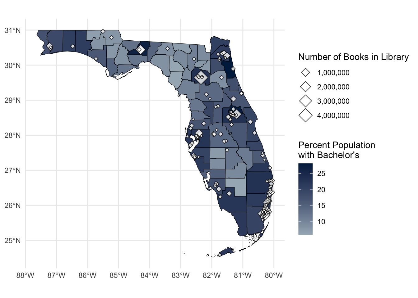
  2. Time permitting: See if you can get rid of the scientific numbering (e.g., 1e+06) so it looks the plot below
    • There’s a few ways, Google and StackOverflow have some helpful answers

  • Obviously, this may not be the most useful map in the world, but the template is very adaptable to a lot of educational situations
    • Using tidycensus we can swap out the base map geography to have most common US geographies and/or swap out any variable available in from the Census Bureau
      • You will also see below a way of getting shapes without Census data using tigris
      • See the example on school districts below
    • Equally, we can swap out the point data to represent anything we have coordinate points for and change the aesthetics to represent any data we have for those points

Supplemental Material: US transformations & tigris basics

  • For the sake of time, I left this until the end as we don’t need it for the assignment. But it may be useful if you are looking to make any maps in your final assignment or the future.

tigris is a package that offers a direct way of downloading US spatial data that is not tied to census data.

  • Note: it’s actually used by tidycensus behind the scenes to get your spatial data
  • If you get spatial data from tigris it won’t come with any additional data to plot per say, but it comes with identifying variables you could use to pair up with external data using something like left_join()

Mapping School Districts

  • If we wanted to plot Census data about the population in these school districts we could get these from tidycensus with geography = "school district (unified)"
  • If instead we have school district data we want to plot, or we are only interested in the boundary, we might want to download the spatial data for school districts directly
    • In that case, it might be easier to use tigris directly to get the blank shapefiles.
    • The function names for tigris are really simple.
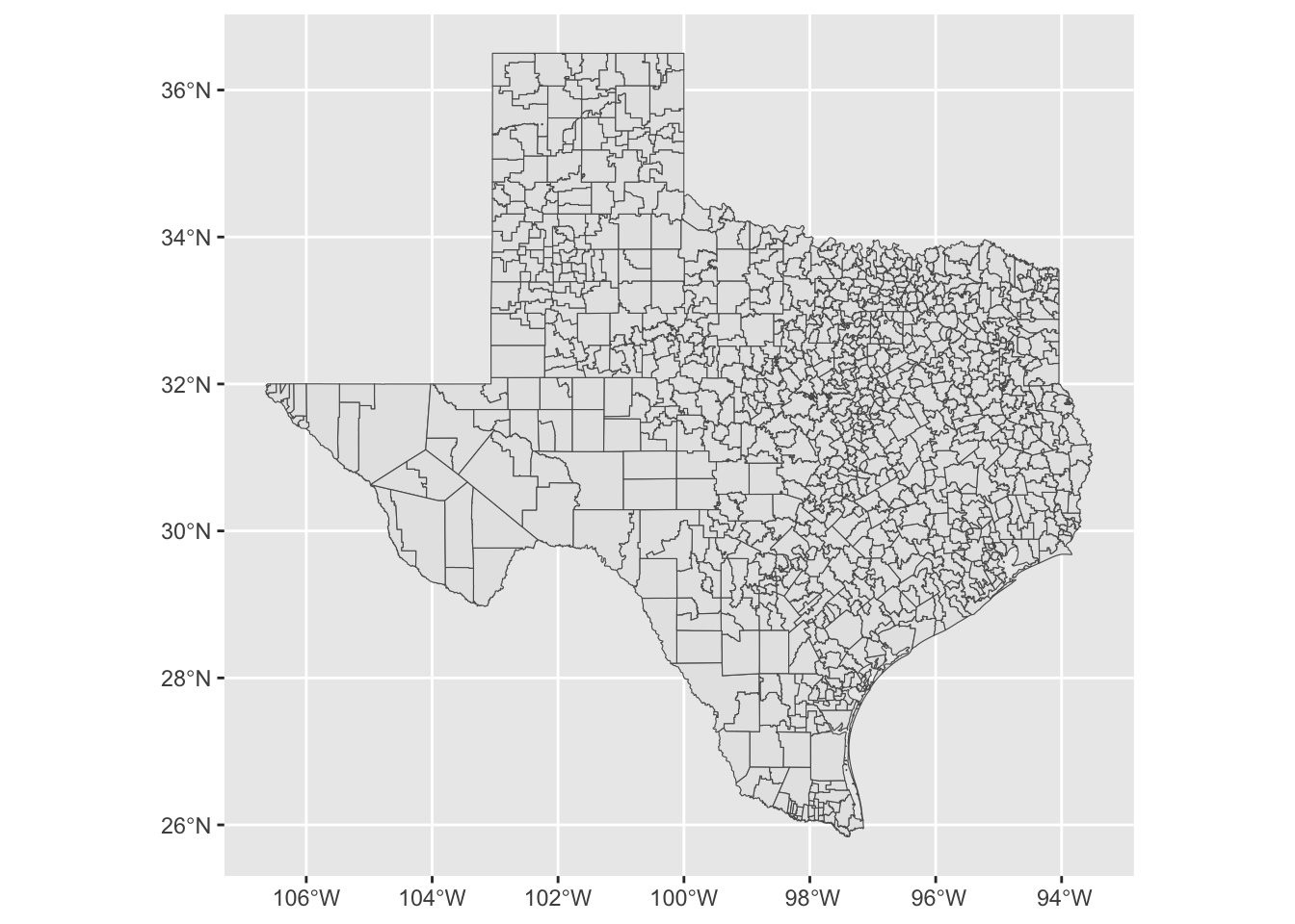
      • school_districts() for example retrieves a shapefile for US school districts
ggplot() +
  geom_sf(data = df_school_dist_tx,
          aes())

  • You’ll notice we actually left aes() blank, as geom_sf() will automatically make the spatial elements for us and right now we have no additional info to add to plot elements like fill
  • There is one new argument in there
    • cb = TRUE
      • Stands for cartographic boundary, basically, a less detailed line that makes for faster and easier mapping
        • If the border detail was really important to your analysis, you might want to set to false, but for mapping it’s usually the best option

50 States and CRS Transformations

  • Finally, we are going to look at how CRS projections changes national maps
    • First, we need to download some basic spatial data for the 50 states
      • Like I said before, tigris function names are really simple
        • states() downloads spatial data for the states
          • Similarly to cb = TRUE we discussed above resolution = "20m" sacrifices a little detail for speed and efficiency for mapping

Like we did before, let’s take a peak at our newly downloaded data.

## look at head of state data
head(df_st)
Simple feature collection with 6 features and 9 fields
Geometry type: MULTIPOLYGON
Dimension:     XY
Bounding box:  xmin: -179.1743 ymin: 24.49813 xmax: 179.7739 ymax: 71.35256
Geodetic CRS:  NAD83
  STATEFP  STATENS    AFFGEOID GEOID STUSPS      NAME LSAD        ALAND
1      22 01629543 0400000US22    22     LA Louisiana   00 1.119153e+11
2      02 01785533 0400000US02    02     AK    Alaska   00 1.478943e+12
3      24 01714934 0400000US24    24     MD  Maryland   00 2.515199e+10
4      55 01779806 0400000US55    55     WI Wisconsin   00 1.402923e+11
5      12 00294478 0400000US12    12     FL   Florida   00 1.389617e+11
6      13 01705317 0400000US13    13     GA   Georgia   00 1.494866e+11
        AWATER                       geometry
1  23736382213 MULTIPOLYGON (((-94.04305 3...
2 245378425142 MULTIPOLYGON (((179.4813 51...
3   6979074857 MULTIPOLYGON (((-76.04621 3...
4  29343646672 MULTIPOLYGON (((-86.93428 4...
5  45972570361 MULTIPOLYGON (((-81.81169 2...
6   4418360134 MULTIPOLYGON (((-85.60516 3...
  • Similar to before, we have
    • A spatial summary at the top
    • A set of normal looking columns with different ID codes and names
    • An attached geometry for each row
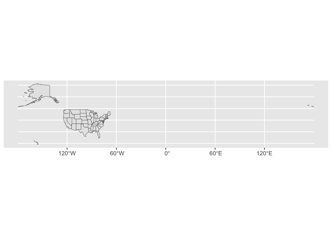
  • If we simply plot this with no aesthetics, we get the outline of all states, but there is something about it that makes it less ideal for a quick data visualization…
## quick plot of states
ggplot() +
  geom_sf(data = df_st,
          aes(),
          size = 0.1) # keep the lines thin, speeds up plotting processing

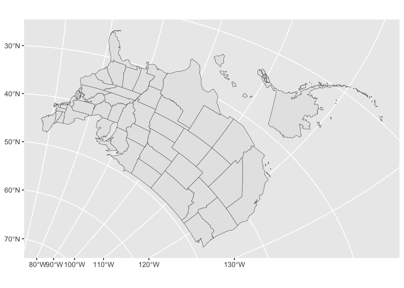
  • As we can see, while the map is geographically accurate, there is a lot of open ocean on the map due to the geographic structure of the US
    • The tail of Alaska crosses the 180 degree longitude line, so it wraps to the other side of the map
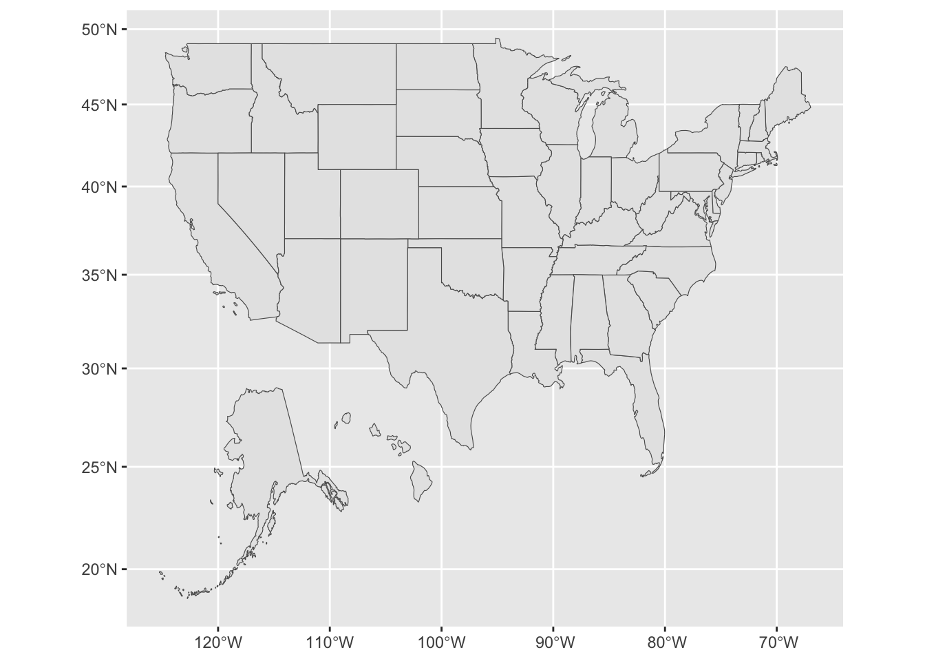
  • Often when we see maps of the US, such as on election night, Alaska and Hawaii are moved to make it easier to read
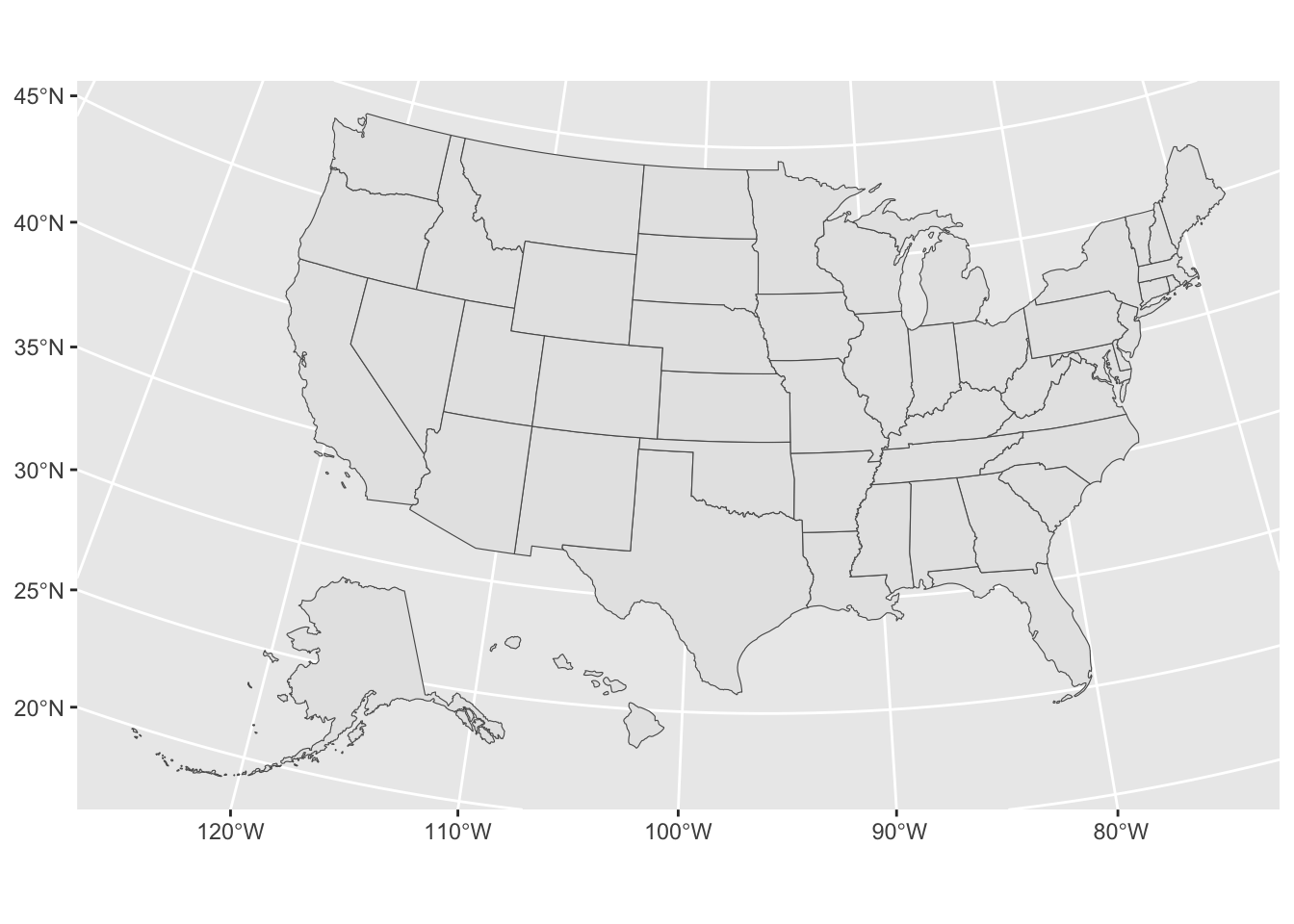
    • Tigris offers an easy way of doing this
      • shift_geometry()
        • should work on any spatial data with Alaska, Hawaii, and Puerto Rico
## replotting with shifted Hawaii and Alaska
ggplot() +
  geom_sf(data = shift_geometry(df_st),
          aes(),
          size = 0.1) # keep the lines thin, speeds up plotting processing

  • Although not always a good idea, if you’re looking to plot the 50 states in an easy-to-read manner, this can be a really useful tool
    • Note: it does not move other U.S. territories like Guam by default, so you may have colleges and schools out there you need to deal with
    • Note: this can re-project your data, so you need to make sure your CRS is what you want after this (as we will do in our final examples)
  • Never do spatial analysis on data you’ve done this to, it will be severely off
    • I recommend only ever using it inside geom_sf()
      • This way you never change your data
        • You don’t want to accidentally say Hawaii is closer to Austin than Oklahoma City is…
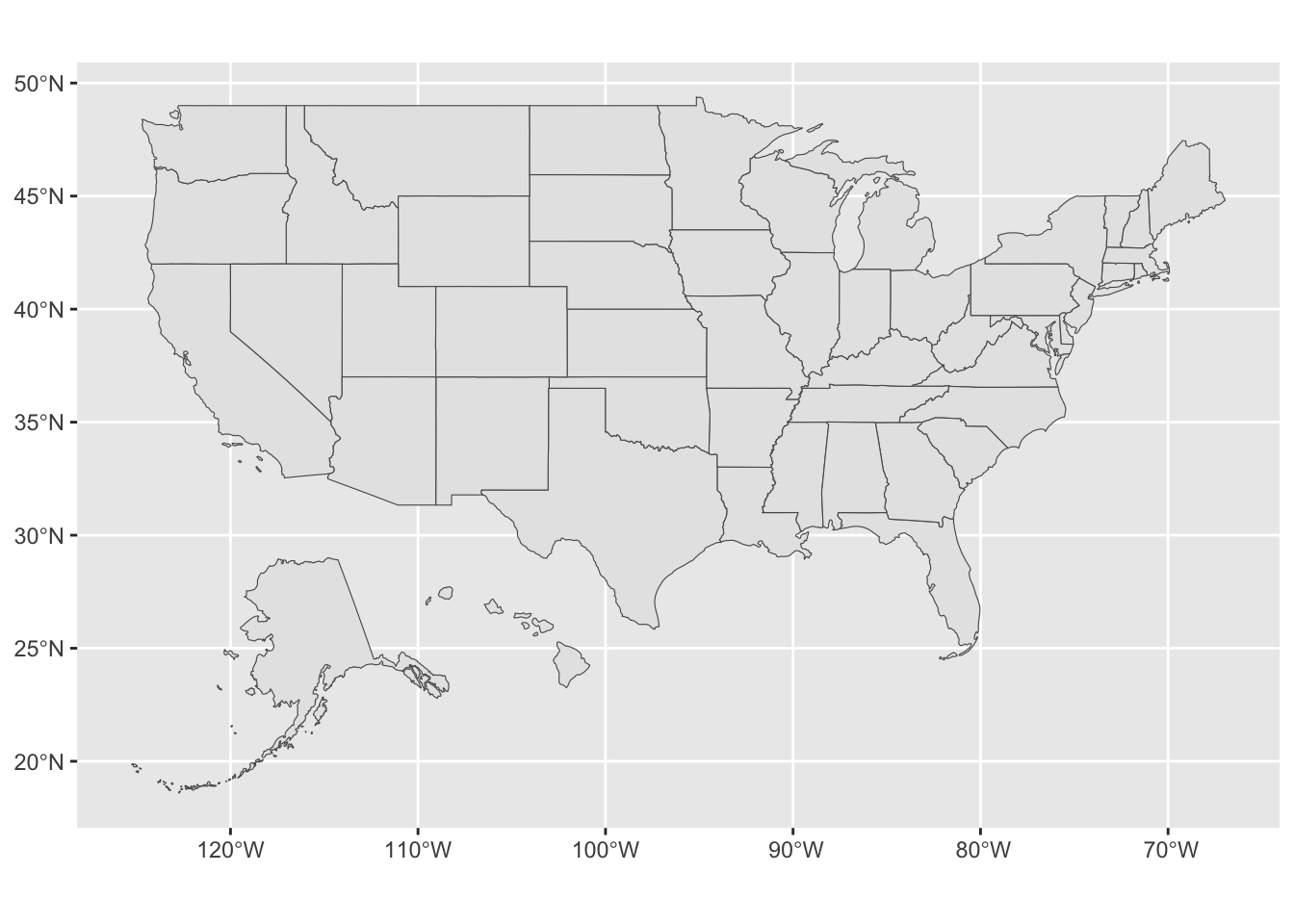
  • Finally, to re-illustrate what a CRS does, let’s plot this two more times
    • First, putting it onto our simple EPSG 4326 CRS from earlier
    • Then, using the Peters Projection referenced in the video clip at the start of class
## change CRS to what we used for earlier map
ggplot() +
  geom_sf(data = shift_geometry(df_st) |> st_transform(4326),
          aes(),
          size = 0.1)

  • See how the line are now a perfect grid, but the shapes of states (look at Montana) are a little different?
    • That’s the power of a CRS!

Quick Exercise

  • Pick a different projection from the list of EPSG projections and see what changes
    • Perhaps try a projection for a different part of the world

  • Finally, let’s please the Organization of Cartographers for Social Equality and look at the Peters projection
    • Note: while this projection is great for showing comparably accurate area across the globe, it does that by other trade offs not acknowledged by Dr. Fallow from OCSE
    • No projection is universally better, each is better for the task it was designed for
      • That’s the key with CRS, find the best one for the task you’re doing.
## change CRS to requirements for Peters projection
## h/t https://gis.stackexchange.com/questions/194295/getting-borders-as-svg-using-peters-projection
pp_crs <- "+proj=cea +lon_0=0 +x_0=0 +y_0=0 +lat_ts=45 +ellps=WGS84 +datum=WGS84 +units=m +no_defs"

ggplot() +
  geom_sf(data = shift_geometry(df_st) |> st_transform(pp_crs),
          aes(),
          size = 0.1)

  • See how to the gap between 45 and 50 degrees north is much smaller than between 20 and 25 degrees north?
    • That’s the projection at work
      • Think about how this reflects how the globe is shaped and how that affects area (the focus of the Peters projection map)

Assignment Template

For this week’s assignment, you have two options, make another map similar to the one we made in class, or, make a map you can use in your final project

Option One

Using the tidycensus package and code from this lesson, make a different point map following the instructions below:

  1. Modify the tidycensus code to download data for a different geography and a different variable
  2. Make a new base map
  3. Use the same academic libraries IPEDS data (or another IPEDS file if you want) to plot points on your new base map that change aes() based on a new variable

Option Two

Using data from your final project (plus tidycensus and/or tigris as needed) make a map following the guidance from the lesson. This will take a bit more time now, but, if it makes sense for your final project it might save you time later.

  • Note: It still needs to be a geom_sf()

Hint: The main challenge will be working out how to either convert you data to spatial data or merge it with existing spatial data

Submission

Once complete turn in the .qmd file (it must render/run) to Canvas by the due date (usually Tuesday 12:00pm following the lesson). Assignments will be graded before next lesson on Wednesday in line with the grading policy outlined in the syllabus.